Floral Color Mastery
Ethan Sullivan
| 23-04-2026
Walking into a professional florist's shop feels like entering a living painting.
The colors don't just sit next to each other; they dance, vibrate, and breathe life into the room.
Most people grab a random bunch of stems and hope for the best, only to end up with a messy, clashing bundle.

The truth is that stunning floral design isn't about luck; it's about understanding the psychological and visual impact of the color wheel. By mastering a few specific palettes, you can turn a grocery store bouquet into a high-end masterpiece that captures the eye and calms the soul.
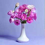
The Power of Monochromatic Elegance
One of the most sophisticated ways to arrange flowers is to stay within a single color family. This doesn't mean every flower is the exact same shade. Instead, you play with different tints, tones, and shades of one hue to create depth and interest without overwhelming the senses.
1. Layering Tones: If you choose pink, combine pale blush ranunculus with deep magenta carnations and medium-pink roses. This creates a "gradient" effect that looks expensive and curated.
2. Texture Focus: When color is consistent, texture becomes the star. Mix smooth petals with ruffled ones, or add fuzzy silver foliage like dusty miller to break up the visual weight of the blooms.
3. Greenery as a Neutral: In a monochromatic set, the green stems and leaves act as the negative space, allowing the various shades of your primary color to "pop" against a natural backdrop.
Creating High-Energy Contrasts
If you want an arrangement that demands attention, look to complementary colors. These are colors located directly opposite each other on the color wheel. Because they share no common base colors, they create maximum contrast and a sense of vibrant energy.
4. Yellow and Violet: This is a classic spring combination. The brightness of yellow sunflowers or daffodils is grounded and intensified by the deep, moody purple of irises or lisianthus.
5. Blue and Orange: For a bold, modern look, pair bright orange lilies with deep blue delphiniums. The warmth of the orange makes the blue look cooler and deeper, creating a striking visual tension.
6. The 60-30-10 Rule: To prevent a high-contrast bouquet from looking chaotic, use one color for 60% of the arrangement, a second for 30%, and a tiny "spark" of a third color for the final 10%.
The Harmony of Analogous Palettes
Analogous colors sit next to each other on the color wheel, such as red, orange, and yellow. These arrangements are naturally pleasing to the human eye because they mimic the transitions found in nature, like a sunset or autumn leaves. This style is perfect for creating a sense of warmth and comfort in a living space.
Operational Guide: The "Sunset Glow" Arrangement
This specific design uses an analogous color scheme to create a warm, inviting atmosphere. Follow these steps to build a balanced, professional-looking centerpiece.
Ingredients:
• 5 Sunset Orange Roses (Primary bloom)
• 3 Golden Yellow Snapdragons (Linear flowers for height)
• 4 Deep Red Dahlias (Mass flowers for depth)
• 2 Stems of Eucalyptus (Filler greenery)
• 1 Wide-mouthed ceramic vase

Steps:
1. Fill your vase with room-temperature water and add floral preservative.
2. Create a "grid" or "nest" with your eucalyptus stems first. This provides a structural base to hold the flower stems in place.
3. Insert the snapdragons at slight angles to establish the height and overall width of the arrangement.
4. Place the red dahlias near the rim of the vase. Because they are the darkest and heaviest-looking color, they should stay low to provide visual "weight" at the base.
5. Distribute the orange roses throughout the middle section, ensuring they are at varying heights so the arrangement looks three-dimensional.
6. Step back and look for "holes" in the color. If one side looks too yellow, tuck in a small red bud to balance the heat of the palette.
Precautions:
• Trim all stems at a 45-degree angle under water to prevent air bubbles from blocking hydration.
• Remove any leaves that would sit below the water line; decaying foliage creates bacteria that will destroy your flowers quickly.
• Keep the arrangement away from direct sunlight and ripening fruit, which releases gases that cause flowers to wilt.
Mastering color in floral design is a journey of observation and practice. Whether you prefer the quiet calm of a monochromatic white bouquet or the fiery energy of a red and orange display, the key is intentionality. By choosing colors that complement or harmonize with one another, you transform a simple hobby into a form of living art. A well-balanced arrangement doesn't just decorate a room—it sets the mood and tells a story through the silent, beautiful language of petals.